Its true what they say - first impressions count. Your website's header is the first thing people see when landing on your site. Multiple eye-tracking studies have discovered humans scan computer and mobile screens starting at the top and making a zig-zag pattern down the screen. The website header's primary function is navigation. But it also plays an important role in communicating your brand's style and look. In this guide, we’ll explore the world of website headers and tackle the question of what the ideal website header size should be.
Website Header Key Principles
1. Branding
Begin with creating an image, graphic, or other visual concepts that show the essence of your product or service. The graphic should show the brand of your business and have a logo as well. An artistic header will have a proper choice of style and color that matches your website that inspires readers.
Big, bold, unconventional: Atlassian
Atlassian's header is big and bold. Perhaps a nod to its namesake, Atlas the Greek Titan God who "carried the heavens upon his shoulders". Atlassian's blue brand is featured throughout hyperlinked copy, call to action buttons and imagery.

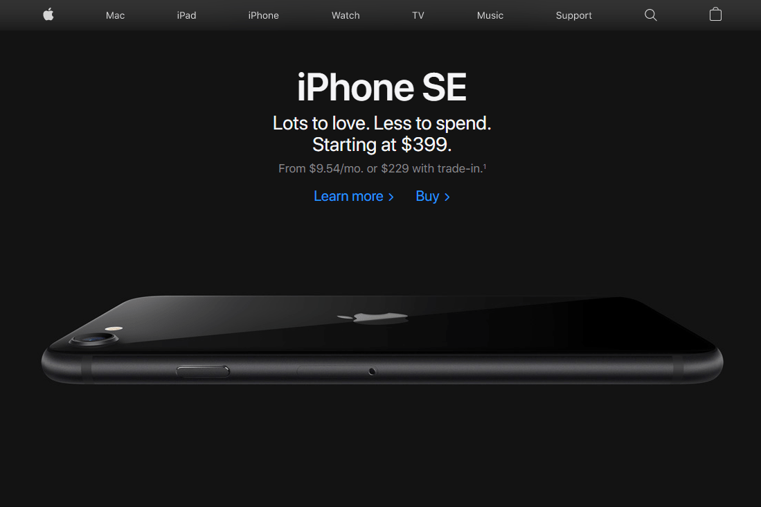
Muted, minimal: Apple
Few brands can achieve the kind of minimalist feel that Apple does. For an organization with many divisions and over 130,000 staff worldwide, it excels at simplifying everything and visually communicating its brand so succinctly.
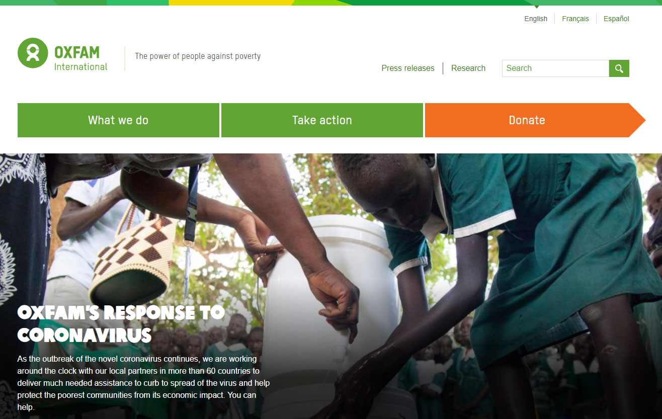
Action-driven: Oxfam
Global NGO Oxfam use their header to drive the most important action: donations. The placement, size, color and prominence of the "action bar" serves not only as a navigation tool but a way to communicate their purpose but most importantly to encourage action.
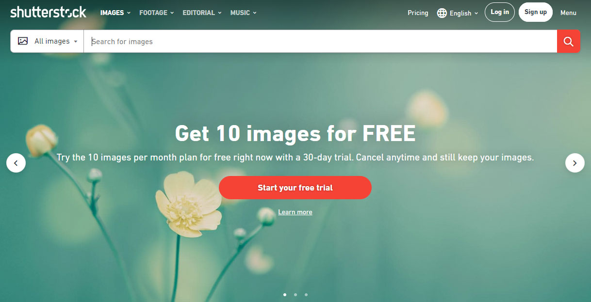
Search front and centre: Shutterstock
Stock image site Shutterstock is all about search. The search bar is prominent and branded seamlessly utilizing the brand font, color and iconography.
2. Size
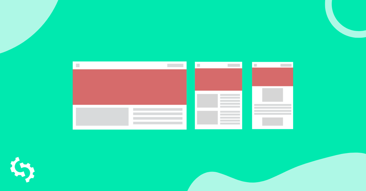
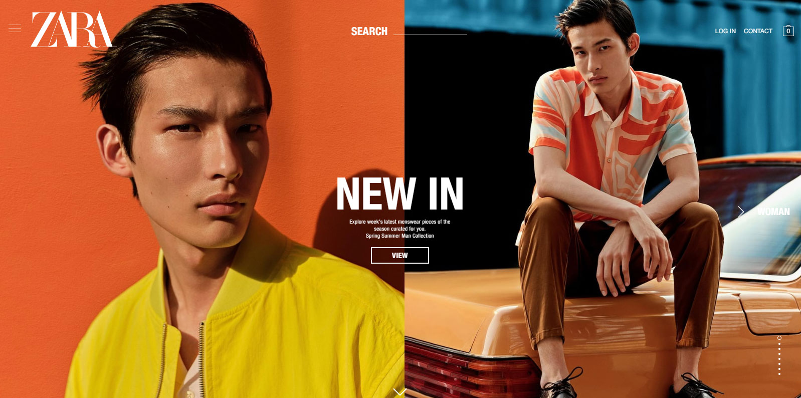
For websites selling products, the header is a useful tool for showcasing popular products and promotions. Carousels or sliders are frequently used to rotate through featured products or sections serving as a launching point into key parts of the site.
Zara's header serves almost as a roadblock, highlighting a carousel of collections. The carousel indicators (dots) are shown vertically in the bottom right while the header fills the screen 100% with navigation overlayed at the top. Its a striking look.
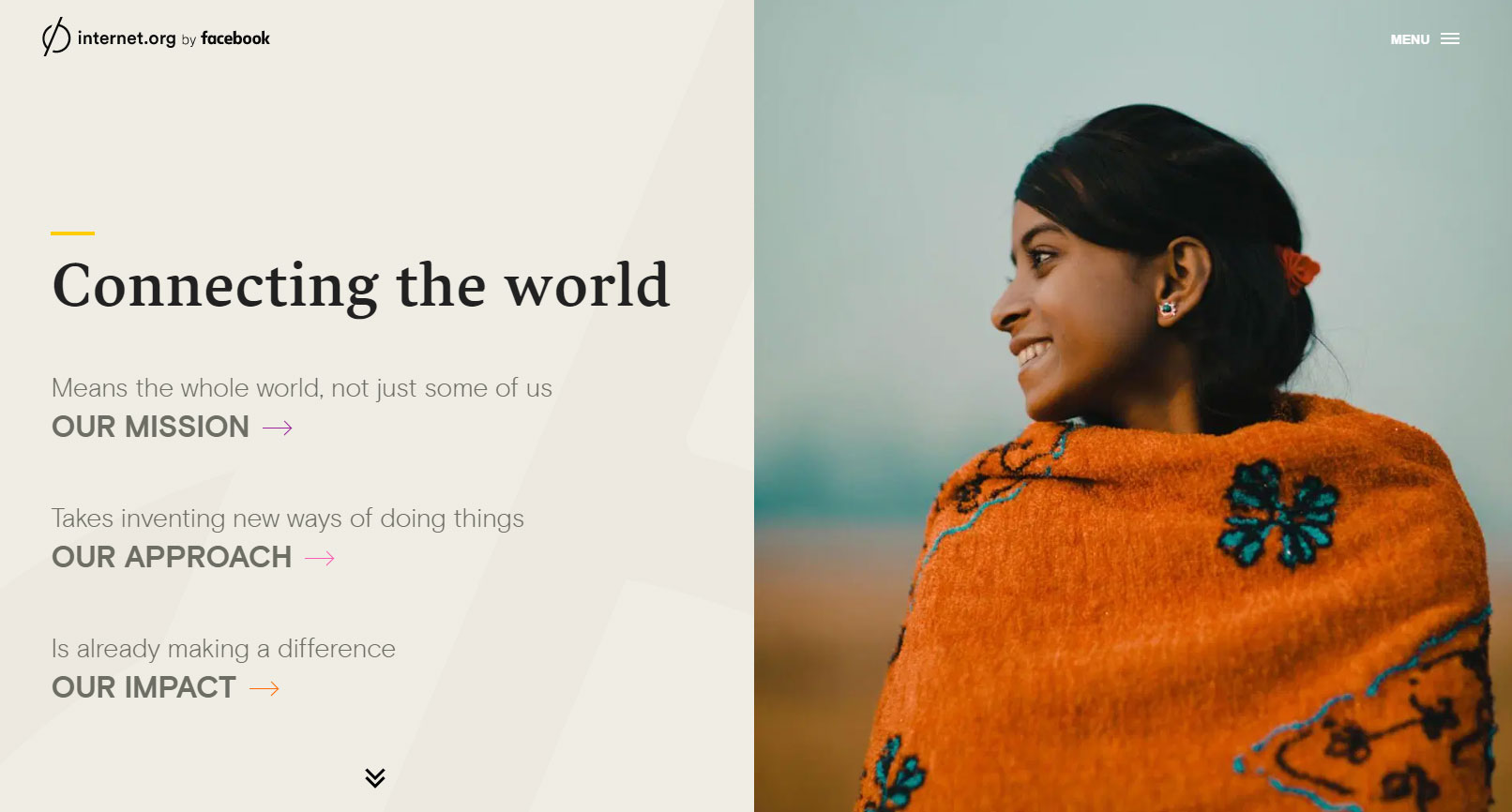
Internet.org is another example of a full-frame header with muted top navigation. But instead of a carousel it uses the left side of the header as a dual navigation and content area. When the user makes a selection the site slides to the left, moving the hero image to the left side revealing the body content on the right side.
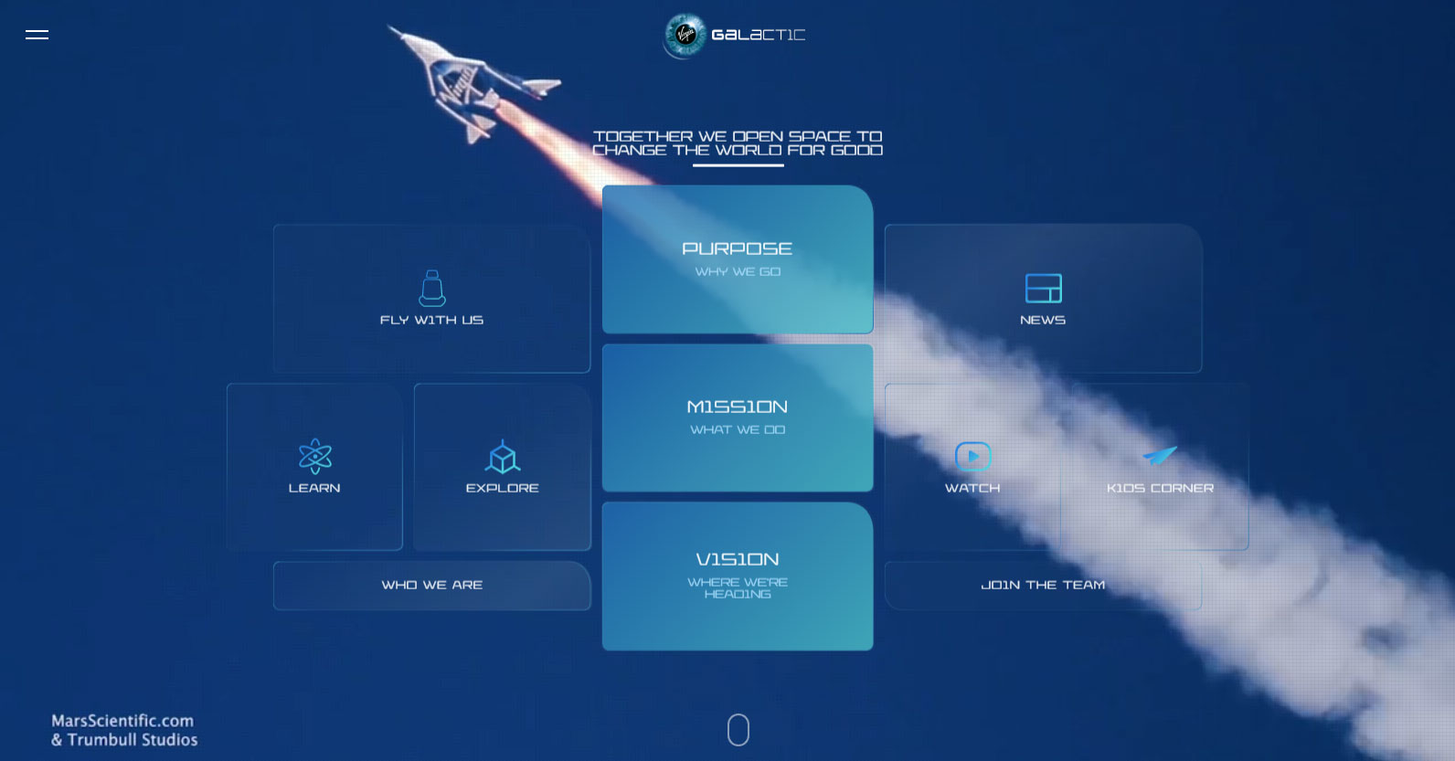
In this full-width variation from Virgin Galactic, the header serves as a hero navigation element with background video providing awe-inspiring visuals.
3. Content
Every element in your site header must work together. The location and size of each object in the header gives users visual clues about how to navigate and use your website when they immediately land. The color of a button, the spacing and padding around elements or the font size of a title can mean all the difference between the user taking the desired action, or not.
The Image Carousel
An image carousel is used commonly in website headers because they achieve a number of things:
- Communicates one piece of content at a time to avoid confusion
- Relies heavily on visual communication (which is best because people generally scan content, as opposed to read content)
- Gives prominence to important content
- Behaves like pre-navigation, enabling the user to explore different content without leaving the main page
- Familiar and expected website element that users know how to use and interact with: swipe through or tap the dots to advance the slides
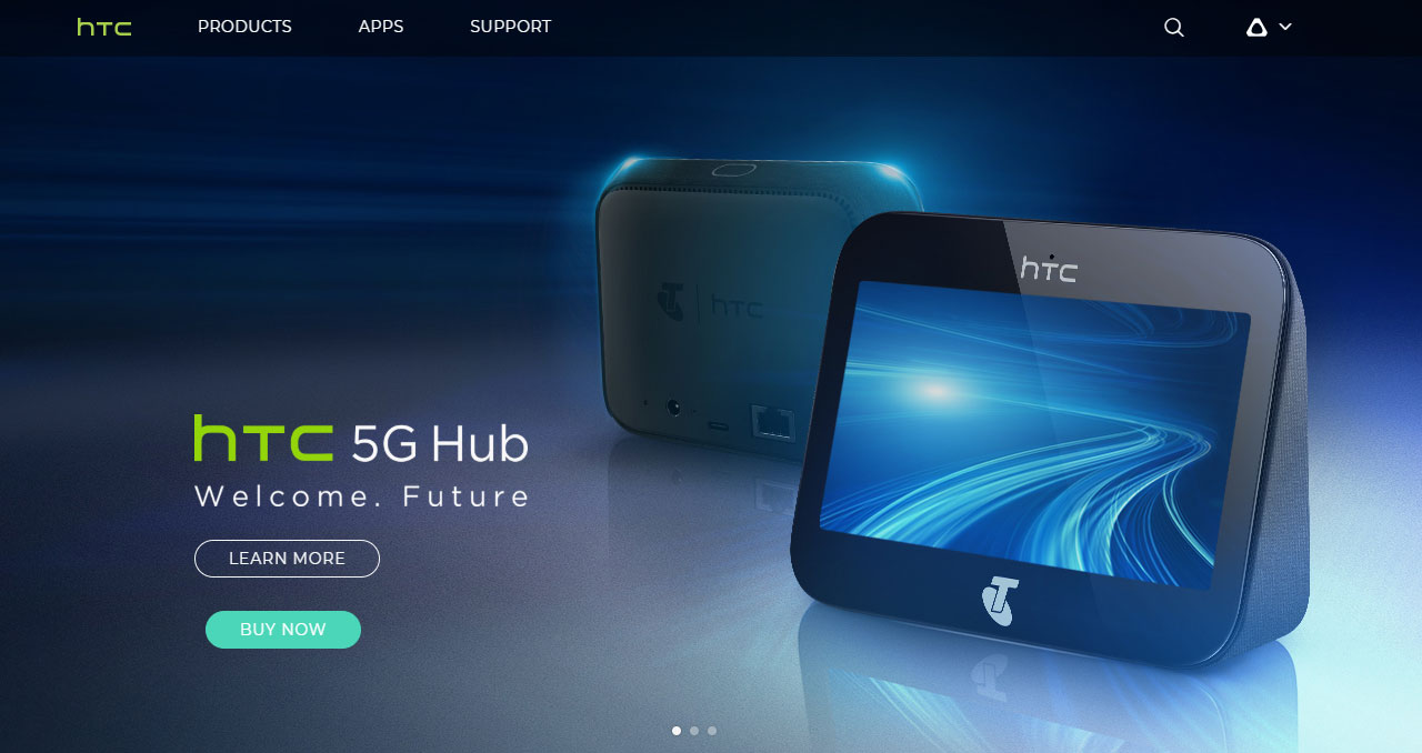
HTC's header has three slides featuring three new technologies:
The Call to Action (CTA)
Sometimes you just want the user to take action. In this case, The Information wants to capture the visitor's email address. By removing every other element and focusing 100% on the CTA, The Information is able to optimize for the desired action:

The Editorial style
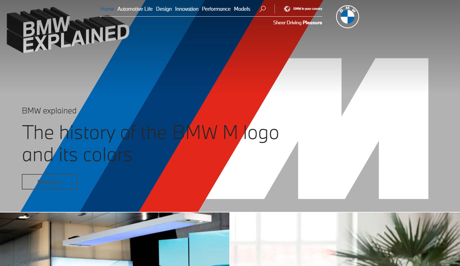
BMW have reimagined their site as if they were a publisher and present stories and articles to the user starting with the hero article in the header about the history of the M logo and colors:
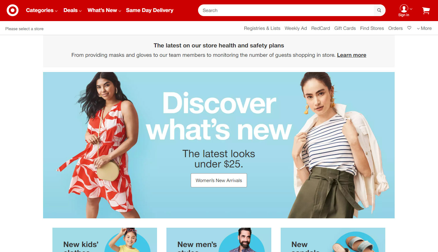
The Catalog style
Target's website emulates their physical catalog with the header used to showcase Women's New Arrivals followed by the various other departments within the store mixing collections, promotions, individual products and information.
How to find the right size Using WordPress
The best place to start is to check your “Media Settings” under the “Appearance” tab from the WordPress Admin.
- The best image width for an image in a blog post (for example, 1024px is for the Showcase Pro theme), and
- What size image will work best in your theme’s sidebar (300)
However, this section won't provide optimal image dimensions for your Home page, Header image, or page banners.
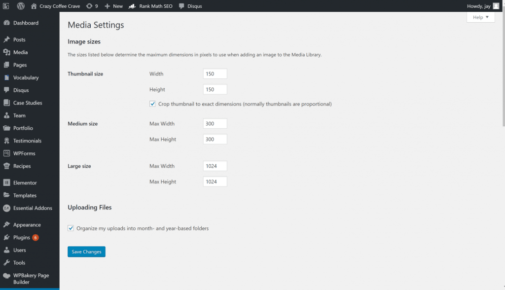
Depending on your theme, WordPress should list optimal image sizes for your home page/ header image under Appearance —> Customize —> Front Page Header Image. Most sizes shown here are around 1600 px by 1050 px.
How to find any page header banner Image size
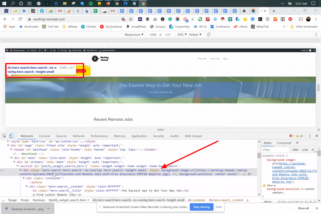
Enter the URL of your website on Chrome Browser and use Inspect to get the exact image size using the following steps:
-
- Right + Click / Control + Click (Mac) on the web page
- Click Inspect
- Click on the 3 dot menu so you can view the Elements at the bottom so the page view is not responsive
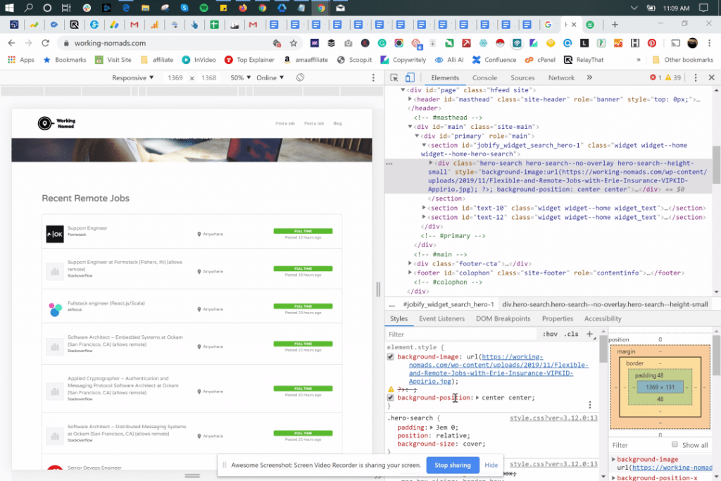
Here’s the Element at the bottom of the page:
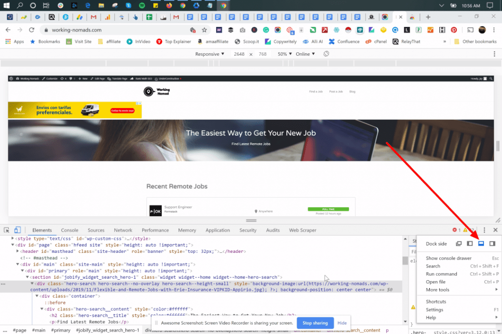
-
- Right-click the header image. Choose an image which is the same as the header banner
- Dimensions: Set exact image size used in the theme’s demo
In this example below, the size is 2548 px x 227 px. While the width of the header is responsive, the height of the header might be too small to be a header.
What? Not every header banner image is the same size
If the Home header (1600px x 1050px), it is not the same size as the Blog header banner (1080px x 960px), use images that look good in long and narrow spaces.
Recommended website header image pixel size for your website
While screens are getting larger, a header width of 1024px is still the most popular size. Websites are designed for 1024 x 768px resolution.
If you intend to use a header that is more than 1000 pixels, use one of these header sizes:
- 1280px
- 1366px
- 1440px
- 1600px
- 1920px.
These are high-resolution sizes that can adjust to maintain resolutions of more than 1920 without a problem.
What is the right size for your website?
The most popular header sizes for websites:
| HEADER SIZE | WIDTH | HEIGHT | RATIO |
| Header size 1024 | 1024 | 256 | 4:1 |
| Header size 1024
One Third Page (Extra Height) |
1024 | 300 | 24:7 |
| Header size 1024
Half Page |
1024 | 384 | 8:3 |
| Header size 1024 Full Page(Hero Header) | 1024 | 768 | 4:3 |
| Header size 1280
One Third Page |
1280 | 267 | 24:5 |
| Header size 1280
One third Page (Extra Height) |
1280 | 375 | 24:7 |
| Header Size 1280
Half page |
1280 | 400 | 16:5 |
| Header Size 1280
Full Page (Hero Header) |
1280 | 800 | 8:5 |
| Header size 1366
One Third Page |
1366 | 256 | 16:3 |
| Header Size 1366
Half Page |
1366 | 384 | 32:9 |
| Header Size 1366
Full Page (Hero Header) |
1366 | 768 | 16:9 |
| Header Size 1440
One Third Page |
1440 | 300 | 24:7 |
| Header Size 1400
Half Page |
1440 | 450 | 16:5 |
| Header Size 1440
Full Page (Hero Header) |
1440 | 900 | 8:5 |
| Header Size 1600
One Third Page |
1600 | 300 | 16:3 |
| Header Size 1600
Half Page |
1600 | 450 | 32:9 |
| Header Size 1600
Full Page (Hero Header) |
1600 | 900 | 16:9 |
| Header Size 1920
One Third Page |
1920 | 360 | 16:3 |
| Header Size 1920
Half Page |
1920 | 540 | 32:9 |
| Header Size 1920
Full Page (Hero Header) |
1920 | 1080 | 16:9 |
In conclusion
Think first about what you want your users to do when they land on your site and optimize your header for that action. Ensure your images are no larger than 72 dpi and that they use the RGB color format. The less elements you have in your header the more focused the desired action.
Conversely the more elements in the header the more the user is burdened with scanning the content and interpreting what is most relevant to them. There is no right or wrong, it all depends on your typical user journeys and intended action you want to drive.
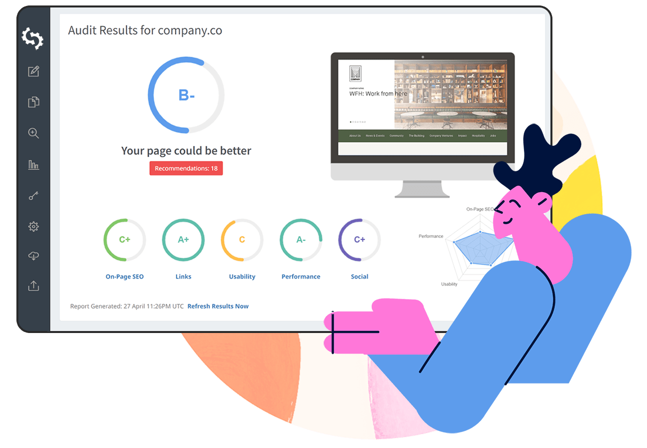
Keep in mind, the more rich media in your header, the longer your loading time and larger your website page size. Always check your website load speed with SEOptimer to ensure you strike a good balance of optimal user experience and optimal load speed.