
What is a Viewport?
Viewport is a meta tag located in the <head> of the HTML. It’s the visible part of a web page that a user can see from their device or monitor. Incorrect viewports will result in users having to side-scroll while browsing the website instead of the site fitting perfectly on their device screens.
Why is viewport important?
Mobile-friendly sites rank higher, period. In order to achieve maximum mobile friendliness with the least investment, sites must reduce the time a user spends scrolling or resizing a page.
Creating a responsive design for the website is essential as they are expected to be visited from all types of users and on any device. It’s up to you to provide the best possible version of your site using viewport for each device.
Impact of mobile viewport in SEO
Configuring your mobile viewport is the easiest and most effective way to increase the mobile friendliness of your site. Google mentions viewport meta tags first in their responsive web design basics, and reflects the SEO guidelines that every site should follow. With the mobile-first initiative, they go on to say “pages optimized for a variety of devices must include a meta viewport tag in the head of the document.”
Viewport best practices
In order to ensure that a page is showcased in a mobile-friendly way, here are some tips you can follow:
Avoid rendering the page to a specific width, since widths may vary from one device to another.
Avoid using absolute width values in your CSS, such as cm, mm, in, px, pt, or pc. Instead, use rather relative width values like em, ex, ch, rem, vw, vh vmin, vmax, and %. Using absolute values can cause the elements of your site to load wider than your viewport allows.
Manually test your site responsiveness and viewport readiness
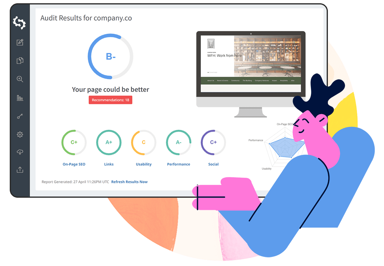
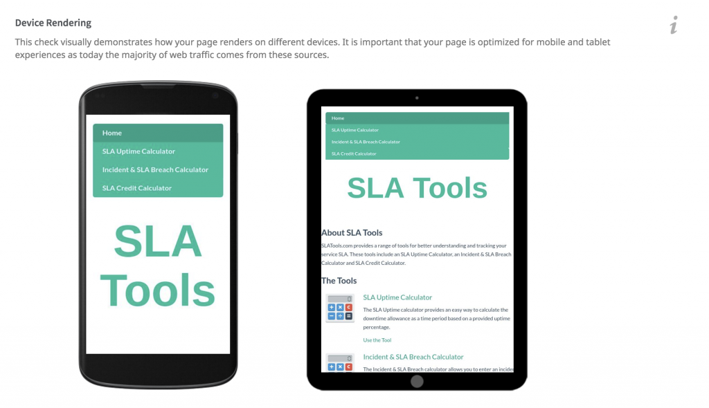
Simplest and the quickest way to identify how your site looks on different devices is to create your SEOptimer report and review the Device Rendering section of the report:
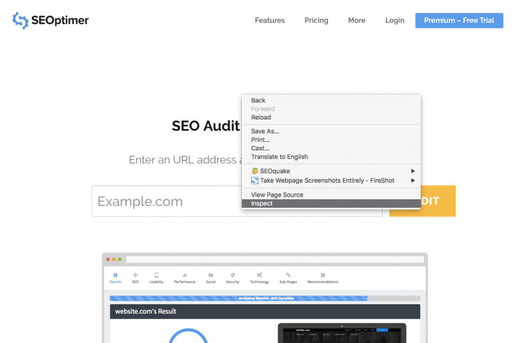
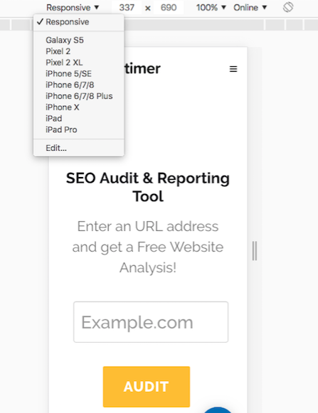
You’ll want to test your site with either your own device or by using Chrome “Inspect” in order to view how your site appears based on the variety of devices provided by Google. Note that using the Chrome browser does not let you drag your screen left to right or use pinch-to-zoom.
Once you start viewing your site, drag the right side to change the width and see how well your site is designed for mobile users.
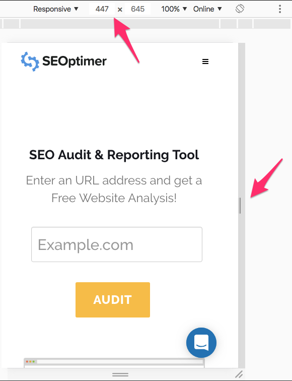
You can also select popular devices and determine if each device is being displayed correctly.
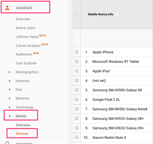
Want more devices? Depending on your site needs, you can determine what devices your site encounters most in Google Analytics.
You can also go to Audience > Mobile > Devices and find the most popular devices being used to view your site.
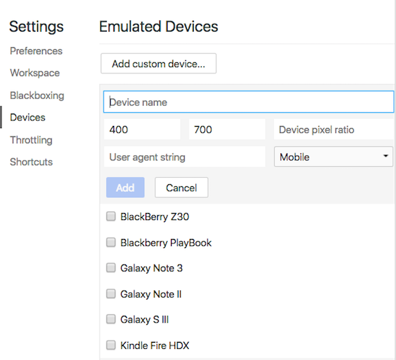
If the devices listed are not based on the most popular devices out there currently, you can locate the device by name or add custom devices based on the pixel ratio.
To add a custom device:
Go to DevTools Settings > Devices > Add custom device.
Then enter a device name, width, height, device pixel ratio, and user agent string.
How to configure the mobile viewport for your site
There are three main ways to design a mobile-friendly site depending on your current mobile site design: Dynamic, Separate URL and Responsive design.
Dynamic design configuration
If you currently have a dynamic design, you’re required to build an entire separate page to serve different versions and tell each user agent what they should access from the same URL. You will have to use the Vary HTTP header on the page. Below is an example of how to create that request:
GET /page-1 HTTP/1.1
Host: www.example.com
(...rest of HTTP request headers...)
HTTP/1.1 200 OK
Content-Type: text/html
Vary: User-Agent
Content-Length: 5710
(... rest of HTTP response headers...)
Here’s more information regarding dynamic design configuration.
Separate URLs configuration
Separate URLS call for more development resources and also requires you to build a whole new site and host it on a subdomain like www.m.example.com. To help search engines understand separate mobile URLs, you’ll need to create annotations for both desktop www.example.com and mobile www.m.example.com devices.
Here are examples of how to annotate each URL:
On the desktop page (http://www.example.com/page-1), add:
<link rel="alternate" media="only screen and (max-width: 640px)" href="http://m.example.com/page-1">
and on the mobile page (http://m.example.com/page-1), the required annotation should be:
<link rel="canonical" href="http://www.example.com/page-1">
This rel="canonical" tag on the mobile URL pointing to the desktop page is required.
Sitemap annotation needs to include the following:
<?xml version="1.0" encoding="UTF-8"?>
<urlset xmlns="http://www.sitemaps.org/schemas/sitemap/0.9"
xmlns:xhtml="http://www.w3.org/1999/xhtml">
<url>
<loc>http://www.example.com/page-1/</loc>
<xhtml:link
rel="alternate"media="only screen and (max-width: 640px)"
href="http://m.example.com/page-1" />
</url></urlset>
Here’s more information on separate url configuration.
Responsive design configuration
Responsive design is the easiest and most effective way to create a website recommended by Google. The viewport configuration must make the page load with a width matching the device screen width, like so:
<meta name="viewport" content="width=device-width, initial-scale=1.0">
A <meta> viewport element gives the browser instructions on how to control the page's dimensions and scaling.
Adding the width=device-width code will ensure the page is resized to match the screen’s width, which will also vary depending on the user’s device.
The initial-scale=1.0 part sets the initial zoom level when the page is first loaded by the browser.
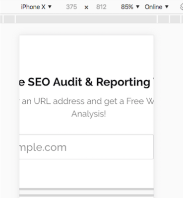
After setting a page’s viewport, the next step should be to size the page’s content. Here’s an example of a mobile-friendly viewport that adjusted its content according to the user’s display:

In this example, if viewport has been disabled or configured to only desktop, you will need to move it sideways or pinch-to-zoom to view the whole site on the device.
How to configure mobile viewport in WordPress
Most themes in WordPress should already have viewport and be mobile responsive. If SEOptimer detected that your WordPress theme does not have a viewport, the best method is to verify it within your WordPress theme.
You’ll need to go to Appearance > Editor > Header.php to do so.
The header.php file should include:
<meta name="viewport" content="width=device-width">
or
<meta name="viewport" content="width=device-width, initial-scale=1.0">
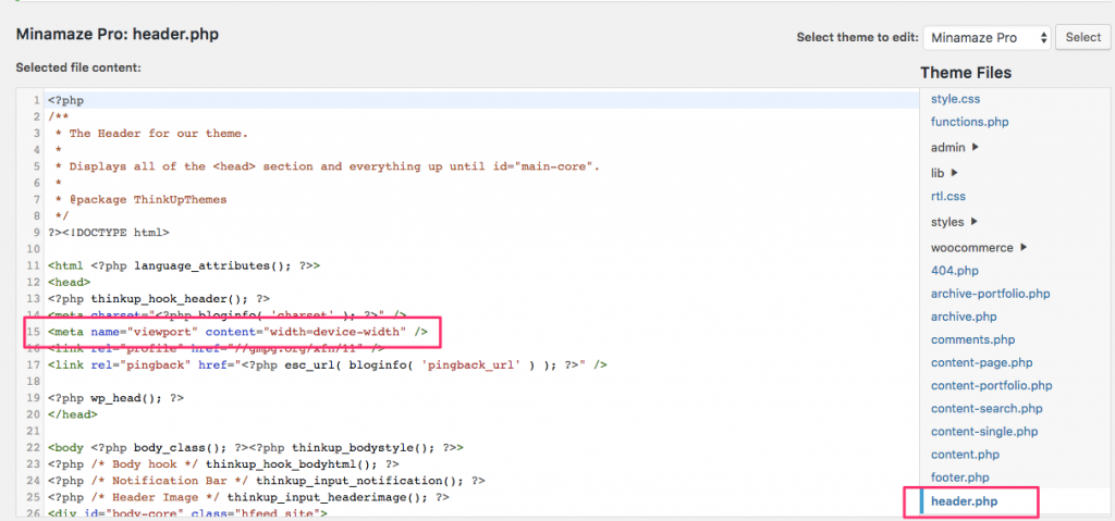
If you do not currently have viewport in the header.php file and you’ve already done the responsive check, check with your theme developer.
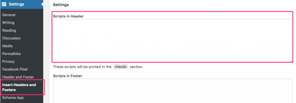
If accessing header.php seems too technical, you can install the “Insert Headers and Footers” plugin from WordPress and enter the viewport in the header section.
How to configure mobile viewport in Wix
Unfortunately, you can’t configure or fix Wix viewports at the moment.
Wix uses the meta tag:
<meta id="wixMobileViewport" name="viewport" content="width=320, user-scalable=no">.
So, when SEOptimer or Google mobile friendly tester checks your site, you will lose points for mobile friendliness. That does not mean that you’ll lose rank or need to switch over to a different platform, it just means that the detection is based on a device width that is scalable and adjusted per device.
You can find more information regarding Wix viewport issue here at the following link:
https://support.wix.com/en/article/viewport-configuration-for-mobile-devices
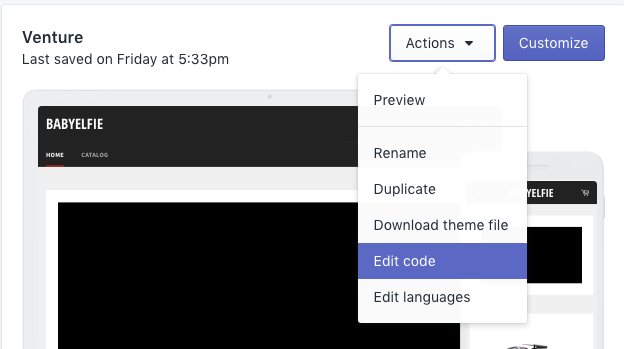
How to configure mobile viewport in Shopify
Shopify’s theme, like WordPress, should come viewport-ready. However, if you need to verify or add in the viewport due to the theme, you can go to Theme > Actions > Edit Code.
Locate the “theme.liquid” file and you’ll see the viewport in the <head> section.
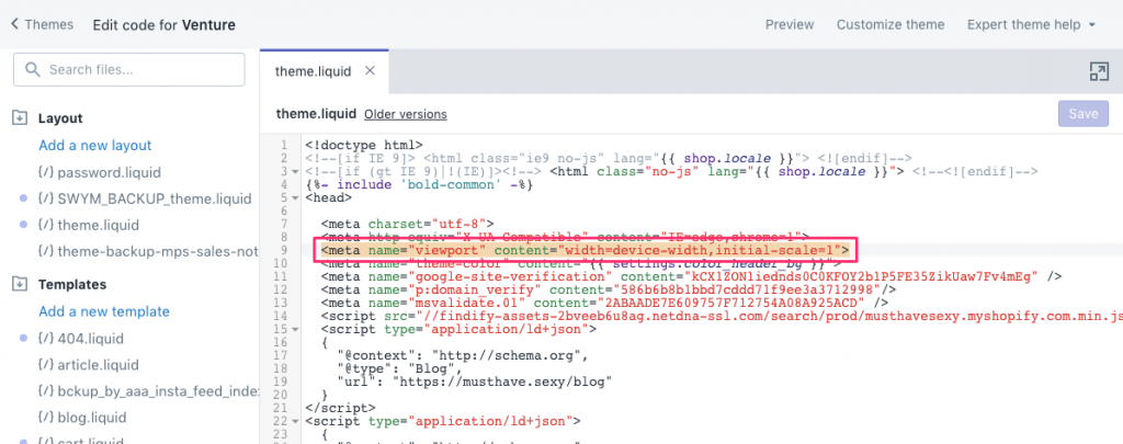
If you cannot find the viewport, then you can contact the theme developer or add the viewport in and go through the responsive test to determine your next steps.