Meta Viewport Tag Checker
SEOptimer’s Meta Viewport Tag Checker scans your webpage to ensure the correct Meta viewport tag is in place.
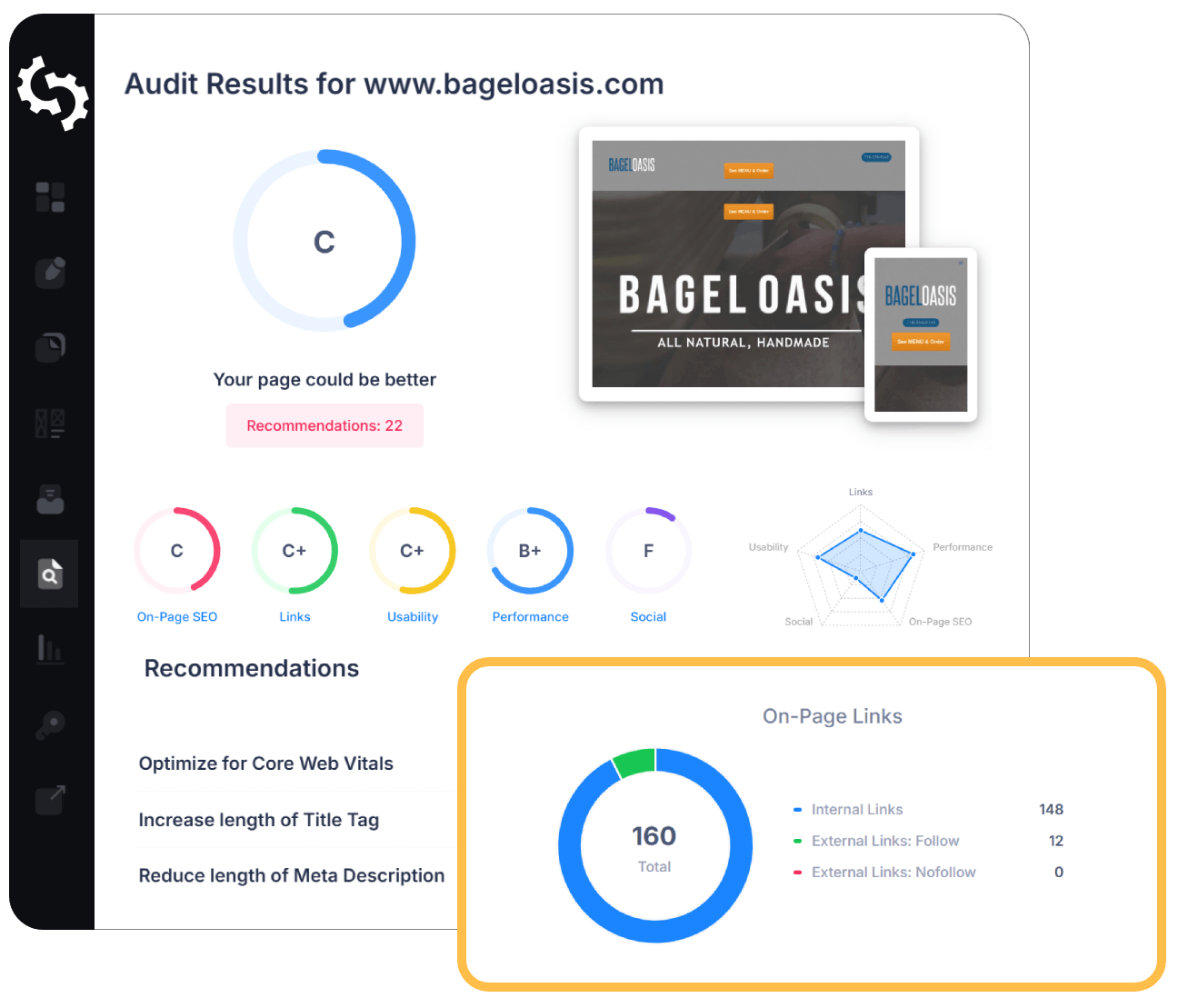
SEO Audit Any Site in Seconds
+ Comprehensive SEO / GEO Tools for Every Function
Run over 100 checks on your website across On-Page SEO, Usability, Performance, Social and Links. Now with GEO in every report. SEOptimer also offers keyword research, rank tracking, backlinks and a full site crawler.

About the Meta Viewport Tag
What is the meta viewport tag?
The meta viewport tag tells a mobile browser how to size the page. Without it, phones assume the page was built for a desktop, render it at around 980 pixels wide, and shrink the result to fit, producing a readable-in-miniature page nobody can use without zooming.
It is a single line in the head, and it is the switch that makes responsive CSS take effect at all. Media queries measure the viewport, so if the viewport is a fiction, every breakpoint you wrote is measuring the wrong thing.
A meta viewport tag checker is worth running on any page built outside your main template, because that is almost always where a missing one turns up.
Does the viewport tag still matter in 2026?
Absolutely, because without it every other piece of mobile work is wasted. You can write a perfectly fluid stylesheet and ship a page that behaves as though it were built in 2009.
Modern themes include it as standard, which is exactly why its absence is so easy to miss. When it is gone it is usually on a custom template, a campaign landing page, or a page assembled by a tool that produced its own head.
The settings matter as well as the presence. A tag that disables zooming is present, correct by this test, and an accessibility failure.
How the viewport tag relates to AI search
It affects the mobile rendering, and the mobile rendering is what gets indexed. A page that cannot lay out properly on a phone is being assessed in its worst form rather than its intended one.
The tag carries no meaning of its own that a crawler reads, but its absence undermines everything downstream of it, including how much of the content is visible in the rendered view.
It is one of the cheapest fixes on this list and one of the few with an all-or-nothing effect.
Viewport best practices
- Include it on every page, in the head.
- Set the width to the device width and the initial scale to 1.
- Do not disable zoom or cap the maximum scale. Preventing zoom is an accessibility failure.
- Check custom and campaign pages separately from the main template.
- Confirm on a real phone rather than in a desktop emulator alone.
What this tool checks
The tool reads the page HTML and reports whether a meta viewport tag is present.
It checks presence rather than settings, so a tag that disables zooming still passes. If the tag is there and the page still behaves badly on a phone, the settings are the next thing to read.
Where to go next
The viewport tag makes responsive layout possible; the rest is whether the layout is any good. See how the page actually renders on phone and tablet screens with the mobile responsiveness test.
Comprehensive SEO Toolbox with over 55 Tools
Check Titles, Meta Descriptions, Headings, Schema, Core Web Vitals, SSL and Robots.txt. Generate Meta Tags, Sitemaps and .htaccess Rules, minify CSS, JS and HTML, and draft copy with our AI Writing Tools - instantly and for free.
Further Reading
See More
Guide to Viewport (HTML Meta Viewport Tag)
What is a Viewport?
Viewport is a meta tag located in the of the HTML. It’s the visible part of a web page that a user can see from t...