Website Mobile and Tablet Responsiveness Tester
SEOptimer’s Website Mobile and Tablet Responsiveness Tester checks how your website looks and functions on mobile and tablet devices, ensuring a seamless and optimized user experience across different screen sizes.
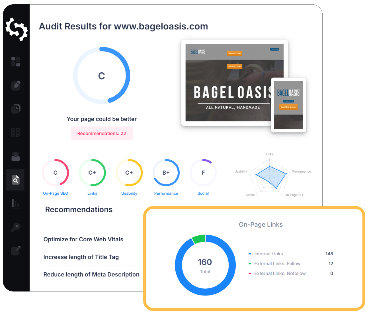
SEO Audit Any Site in Seconds
+ Comprehensive SEO / GEO Tools for Every Function
Run over 100 checks on your website across On-Page SEO, Usability, Performance, Social and Links. Now with GEO in every report. SEOptimer also offers keyword research, rank tracking, backlinks and a full site crawler.

About Mobile and Tablet Responsiveness
What is a responsive website?
A responsive site adapts its layout to the screen it is displayed on, rather than serving a fixed-width design and asking the visitor to pinch and scroll. The same HTML is used everywhere; the presentation changes around it.
It is not only about width. Touch targets, readable text, content ordering and how navigation collapses all need to change on a phone, because the way someone uses a page there is fundamentally different from how they use it at a desk.
Tablets are the case most often forgotten. They fall between the two layouts a site was designed for, which is where a responsive design tends to reveal whether it was genuinely fluid or simply built for two fixed sizes.
Does responsiveness still matter in 2026?
It stopped being optional some time ago. Most visits arrive on a phone, and search engines index the mobile version of a site by default, so the mobile rendering is the version that counts rather than a secondary view of it.
The remaining failures are rarely whole sites. They are individual pages: a wide table, an embedded widget, a pricing comparison, a landing page built outside the main template by someone in a hurry.
Those exceptions matter disproportionately, because they tend to be commercial pages. The blog is responsive; the page that takes payment is the one built in a rush.
How responsiveness relates to AI search
Since indexing is mobile-first, the mobile rendering is what gets read. Content hidden or dropped on small screens can be absent from the version that search engines and AI crawlers actually see, even though it is plainly there on desktop.
Traffic arriving from AI answers also skews heavily mobile, and it tends to be lower volume and higher intent. A page that struggles on a phone squanders exactly the visits that were hardest to earn.
The practical rule is that the mobile version should be the complete version, not a reduced one.
Responsive best practices
- Design for the small screen first, then expand rather than contract.
- Never hide content on mobile that exists on desktop; that content may not be indexed.
- Make tables and code blocks scroll within their own container rather than stretching the page.
- Check tablet widths specifically, where layouts built for two fixed sizes tend to break.
- Test on a real device, not only a resized browser window.
- Check landing pages and embeds separately; they are the usual exceptions to an otherwise responsive site.
What this tool checks
The tool renders the page at several device sizes, including phone and tablet widths, and shows you how it behaves at each.
It captures the rendering rather than grading the design, which is deliberate: whether a layout works is a judgement about your content and audience. Looking at the result is the point of the test.
Where to go next
Responsiveness depends on a few specific things being right. Confirm the meta viewport tag is present, since without it none of your responsive CSS takes effect, then check where your visitors actually are with the mobile website traffic tool.
Comprehensive SEO Toolbox with over 55 Tools
Check Titles, Meta Descriptions, Headings, Schema, Core Web Vitals, SSL and Robots.txt. Generate Meta Tags, Sitemaps and .htaccess Rules, minify CSS, JS and HTML, and draft copy with our AI Writing Tools - instantly and for free.