Web Sitesi Mobil ve Tablet Uyumluluk Test Aracı
SEOptimer'ın Web Sitesi Mobil ve Tablet Uyumluluk Testi, web sitenizin mobil ve tablet cihazlarda nasıl göründüğünü ve çalıştığını kontrol eder, farklı ekran boyutlarında sorunsuz ve optimize edilmiş bir kullanıcı deneyimi sağlar.
Nedir
Bir web sitesi, masaüstü ekran boyutları veya belirli bir telefon ya da tablet modelinin boyutlarına göre değişen çok çeşitli çözünürlüklerde ve formatlarda görüntülenebilir. Cihaz oluşturma, sitenin popüler cihaz çözünürlüklerinde nasıl göründüğüne dair bir önizleme sunarak belirgin sorunları tespit etmeye yardımcı olur. Not edin, yöntemimiz siteyi farklı cihazlarda doğrudan birden fazla kez yüklemek yerine, bir web sitesini yükleyip portlet'ini birkaç boyuta yeniden boyutlandıracaktır.
Nasıl düzeltilir
Genel olarak, bir web sitesi, çeşitli masaüstü ve mobil cihaz çözünürlükleri arasında duyarlı olacak şekilde tasarlanmalı ve test edilmelidir, ayrıca sorunsuz bir şekilde geçiş yapabilmelidir (örneğin bir tarayıcıyı yeniden boyutlandırırken veya bir tableti dikeyden yataya çevirirken).
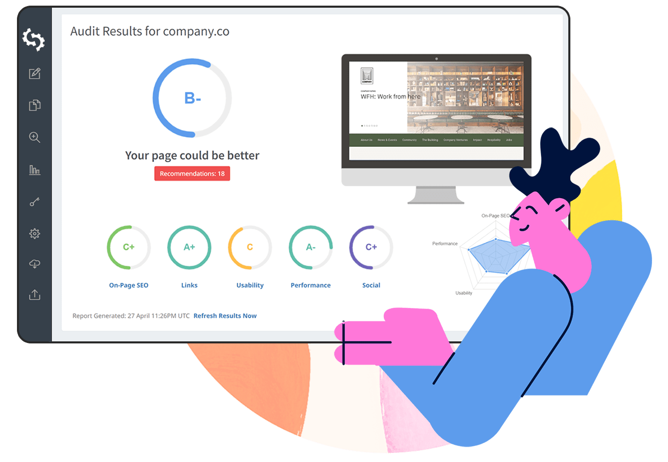
SEOptimer - SEO Denetim ve Raporlama Aracı. Web Sitenizi Geliştirin. Daha Fazla Müşteri Kazanın.
Anında Ücretsiz Web Sitesi Denetimi Alın