Font Size and Legibility Checker
SEOptimer’s Font Size and Legibility Checker analyzes your website's font size and readability across different devices.
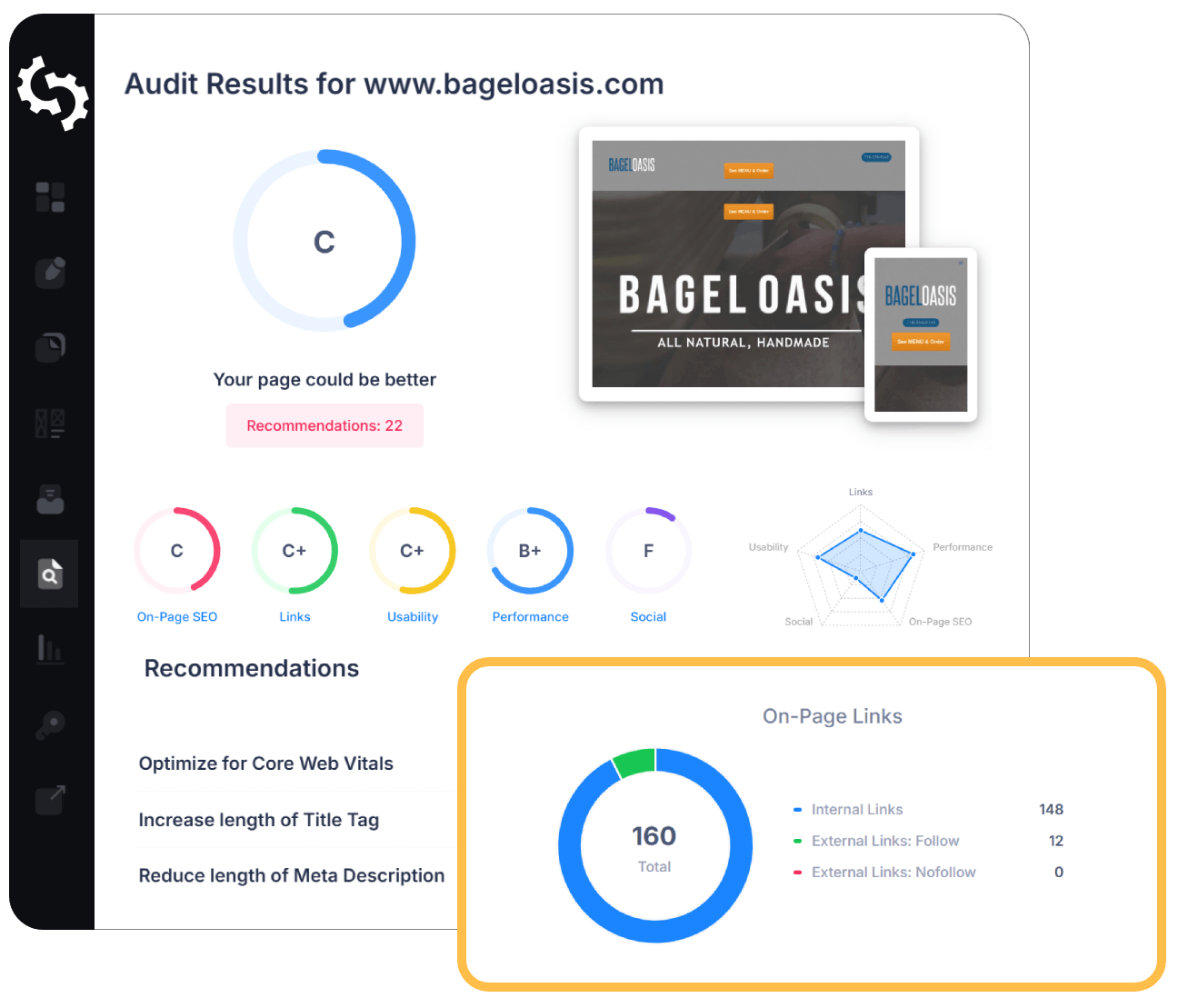
SEO Audit Any Site in Seconds
+ Comprehensive SEO / GEO Tools for Every Function
Run over 100 checks on your website across On-Page SEO, Usability, Performance, Social and Links. Now with GEO in every report. SEOptimer also offers keyword research, rank tracking, backlinks and a full site crawler.

About Font Size and Legibility
What is font size and legibility?
Legibility is whether text can be read comfortably, and font size is the largest single factor in it. On mobile, comfortable reading generally starts around 16 pixels for body text; below that most people are holding the phone closer, zooming, or quietly giving up.
Size is not the whole of legibility, though it is the part that can be measured. Line height, line length, contrast against the background and the typeface itself all contribute, and a page can technically pass on size while still being tiring to read.
A font size and legibility checker is most useful for what it finds in the margins. The main article text is rarely the problem; the captions, footnotes, form hints, disclaimers and table cells set small because they seemed less important almost always are.
Does font size and legibility still matter in 2026?
It matters more as audiences age. Presbyopia is close to universal past a certain age, and a design signed off by people in their twenties routinely fails the readers who are actually paying for something.
It is also the cheapest accessibility improvement available. Larger, better-spaced text costs nothing, breaks nothing, and helps everyone reading in bright daylight, on a moving train, or at the end of a long day.
Accessibility standards referencing text legibility are increasingly enforced rather than merely published, which has moved this from good practice toward obligation in a number of jurisdictions.
How legibility relates to AI search
Text size has no effect on how content is parsed. A crawler reads a 10 pixel footnote exactly as readily as a headline, so there is no indexing penalty to speak of.
The consequence lands on arrival. A visitor sent by an AI answer to a page they have to zoom to read has been failed at the final step, after all the work of being cited in the first place.
That traffic is disproportionately mobile and disproportionately one-shot, which raises the cost of an uncomfortable first impression.
Font size and legibility best practices
- Set body text at 16 pixels or larger on mobile.
- Use relative units so browser and user preferences are respected.
- Keep line height generous; cramped lines are as hard to read as small ones.
- Limit line length, since very wide columns are tiring regardless of size.
- Apply the same standard to captions, labels, form hints and table cells.
- Check contrast alongside size; pale grey text at 16 pixels is still hard work.
- Test in bright daylight on a phone, which is where a great deal of reading happens.
What this tool checks
The tool renders the page and reports whether the text is large enough to be read comfortably on a mobile screen.
It assesses size rather than the other contributors to legibility, so contrast, typeface and line spacing remain yours to judge. A pass means nothing is too small; it does not guarantee the page is pleasant to read.
Where to go next
Legibility is one part of whether a page works in the hand. Check how the layout behaves with the mobile responsiveness test, confirm the meta viewport tag is present since without it text scaling is unpredictable, and review tap target size, which fail for the same reason small text does.
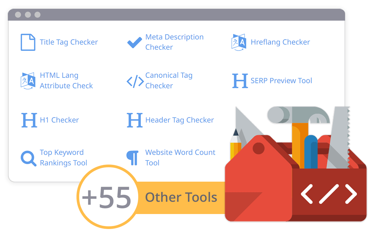
Comprehensive SEO Toolbox with over 55 Tools
Check Titles, Meta Descriptions, Headings, Schema, Core Web Vitals, SSL and Robots.txt. Generate Meta Tags, Sitemaps and .htaccess Rules, minify CSS, JS and HTML, and draft copy with our AI Writing Tools - instantly and for free.